A few years ago I unintentionally caught the home automation virus when I wanted to gather some data in my house. Home automation always seemed to me like an unnecessary, expensive and time-consuming hobby (which indeed proved to be the case).
Fast forward a couple years and I found myself in the position where I’m locally running Grafana to plot graphs for various sensor data from home.
Background
The usefulness of home automation in general can be debatable but I’ve found it enjoyable and also valuable as a tool for creating a more sustainable home. For example by providing data, insights and helping to consume renewable energy at the right moment.
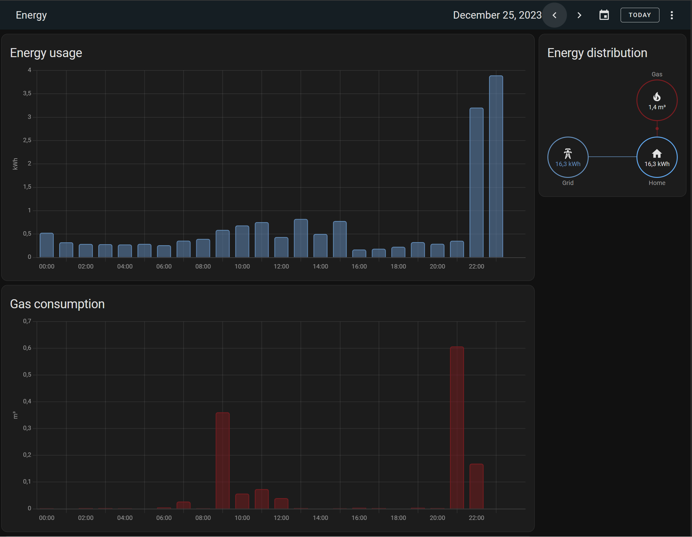
Home Assistant (the open-source home automation system I settled on) has a energy dashboard that shows energy usage, energy production (if you have solar panels), natural gas usage and much more.
The data for this graphs is retrieved with a USB to serial converter from the serial port (P1) of my smart energy meter and fed into Home Assistant with the DSMR integration.
The default energy dashboard and energy cards are great, but I wanted to have a dashboard that is a bit more advanced than the out-of-the-box options could provide.
Why
I have a central heating system that burns natural gas to heat my home. The gas price is still twice as high when compared to the price before the Russian invasion of Ukraine. Partially due to risen operational costs of energy suppliers but also due to taxes (which will be increased again in 2024). Aside from the obvious cost factor it makes sense to consume less energy and transition to more renewable energy sources for heating a home.
I have an pretty old home so making it more sustainable is a multi-year project. Therefore, while this project is ongoing, my current gas usage can be optimized by fine-tuning the temperature setpoint of the thermostat. The data gathered and displayed in Home Assistant can help.
The same data can also be used to measure the effectiveness of sustainability efforts, such as adding wall, roof and floor insulation.
Gas usage in itself does not tell us that much, since it’s heavily influenced by other variables. The biggest factors are the outside temperature and the thermostat temperature setpoint. Gathering metrics on the latter requires a smart thermostat, which I do not (yet) have, so the next best thing will be the temperature of the room in which the thermostat is located. Another part of the gas consumption is hot water usage, but for now we’ll ignore that because it’s only a small amount and it will be fairly consistent throughout the year.
Home Assistant collects both the sensor data as well as energy data to accomplish my goal, using long-term statistics. We could plot each of these measurements in separate graphs which would look something like this:
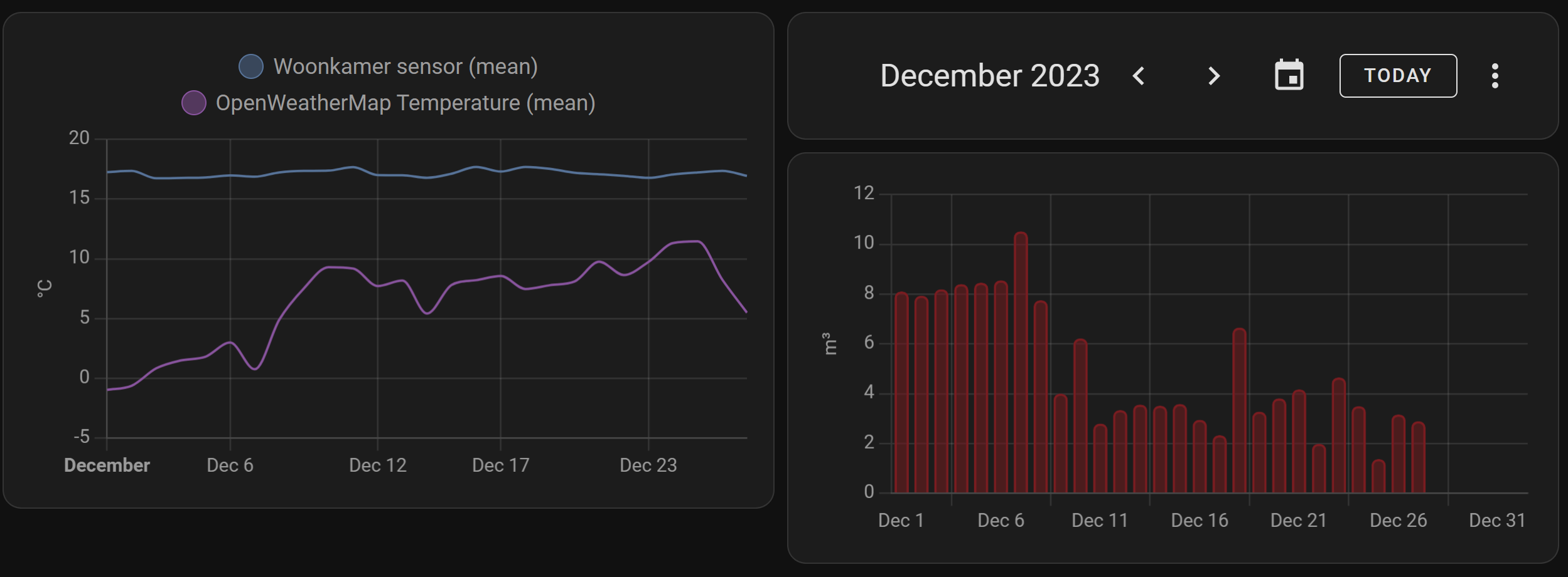
It’s not bad, but there’s no link between the 2 graphs since the energy cards are controlled by the date picker and temperature history by it’s card settings. There’s currently also no way to add day, week and month energy cards on the same dashboard.
Setting up InfluxDB and Grafana
There are several options for custom charts in Home Assistant, e.g. the ApexCharts card and Mini Graph Card but I wanted more flexibility and options.
In comes Grafana. Grafana is a popular open source data visualization platform and it’s available as a Home Assistant add-on.
Grafana cannot connect to the Home Assistant database so in order to get the data we will be using InfluxDB, which is also available as an add-on. This is an InfluxDB v1 database.
Note that in order to use add-ons you’ll need Home Assistant OS or Home Assistant Supervised. The steps below assume you are using Home Assistant OS. These steps are not intended to be a detailed tutorial but should help out with the general direction. The documentation of each add-on provides more detailed information.
Install InfluxDB database
You can host the InfluxDB database anywhere, or use the cloud offering of InfluxDB but we’ll be using an InfluxDB database running inside Home Assistant as an add-on. Like all add-ons this will start as a Docker container on your Home Assistant OS.
- Install InfluxDB from the add-on panel in your Home Assistant instance and start it.
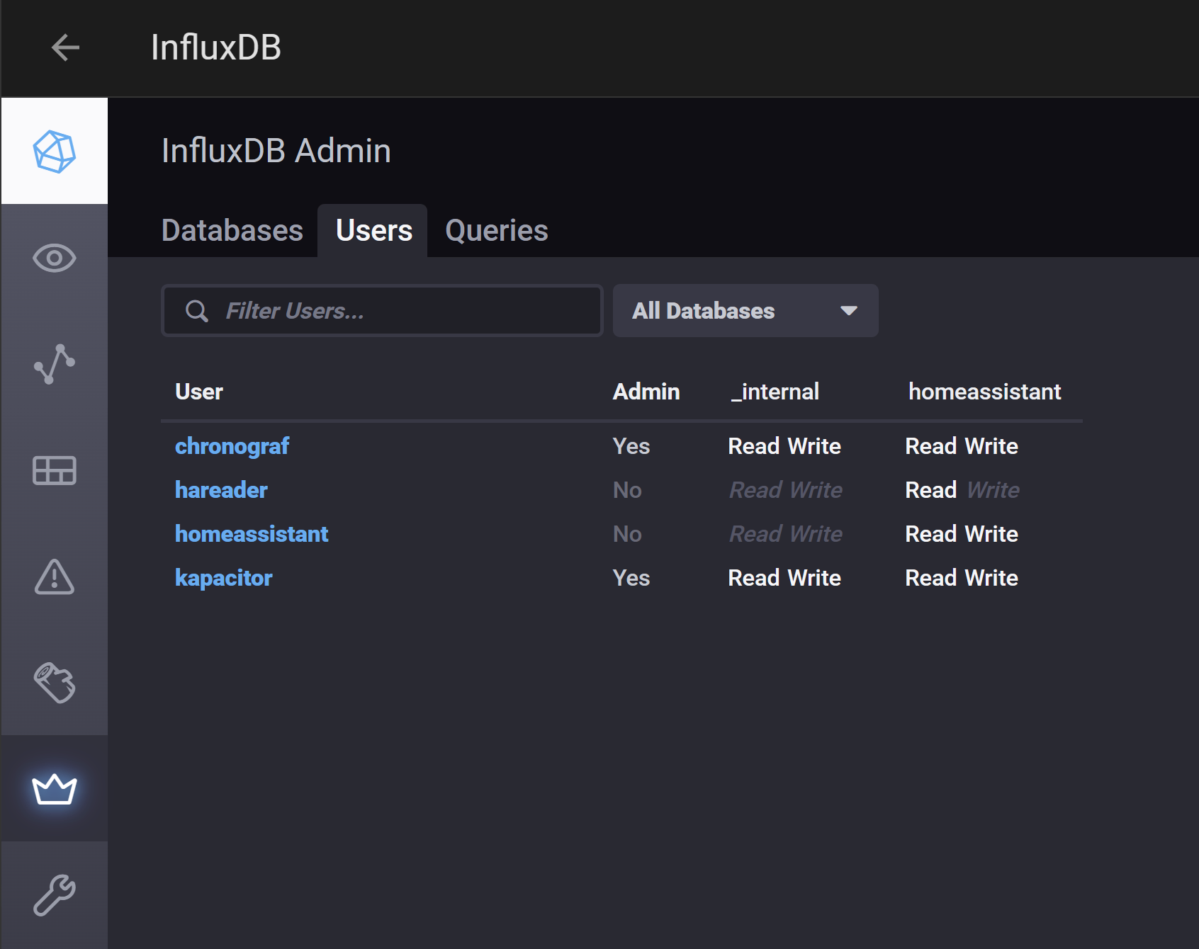
- Open it’s Web UI from the Add-on page and open the InfluxDB Admin page.
- Create a database called
homeassistant - In the same page but in the Users tab, create a user called
homeassistantwith a password. - Give the user read/write rights on the new
homeassistant database.
Setup InfluxDB integration
We now have a database, but it will be empty. We need to instruct Home Assistant to write data to it. Note that data will still be written to the internal Home Assistant database.
Add the InfluxDB integration. There’s no UI to add it, so you’ll need to edit the Home Assistant configuration.yml file using your favorite text editor.
influxdb:
  host: a0d7b954-influxdb
  port: 8086
  database: homeassistant
  username: homeassistant
  password: !secret influxdb_password
  max_retries: 3
  default_measurement: state
  include:
    domains:
      - sensor
In the secrets.yaml file add the following entry with the password you’ve created for your homeassistant InfluxDB user:
influxdb_password: password_created_earlierThis configuration will only store data from the sensor domain in the InfluxDB database. You can extend the list with more domains, for example sun and binary_sensor or include and exclude specific entities. See the documentation for more information.
Restart Home Assistant to apply the configuration.
Install Grafana
Grafana can be hosted anywhere but we’re going to host it in Home Assistant just like InfluxDB.
- Go to the add-on panel, search for Grafana and install and start it.
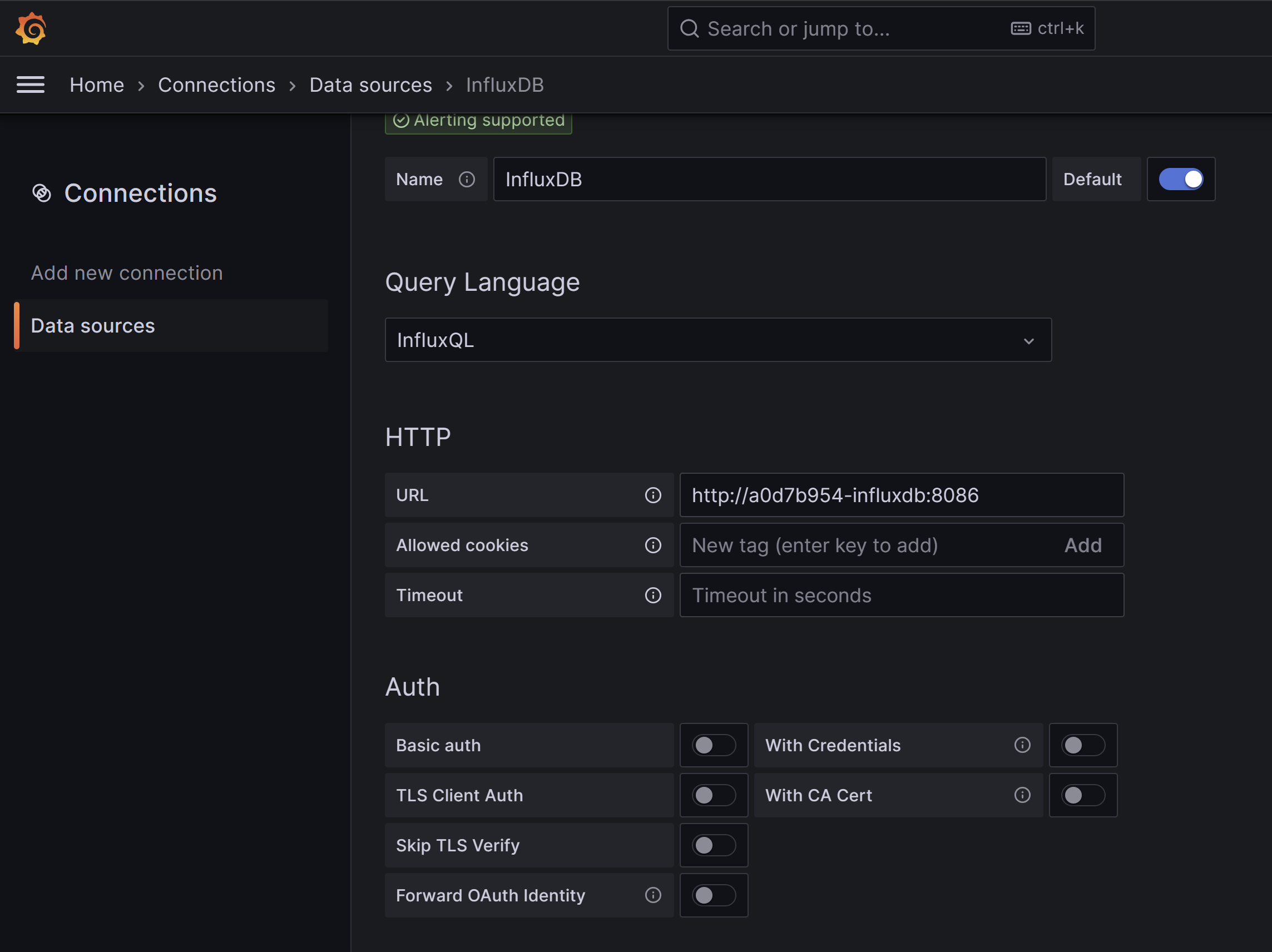
- Open the Grafana UI and go to Connections.
- Search for InfluxDB and add it as a new data source.
- Select query language
InfluxQL. This is more of a personal preference but the examples later will also use InfluxQL to build the dashboard. - In the HTTP section set the URL to
http://a0d7b954-influxdb:8086and leave the other fields empty. - Leave the Auth section empty and scroll down to InfluxDB details.
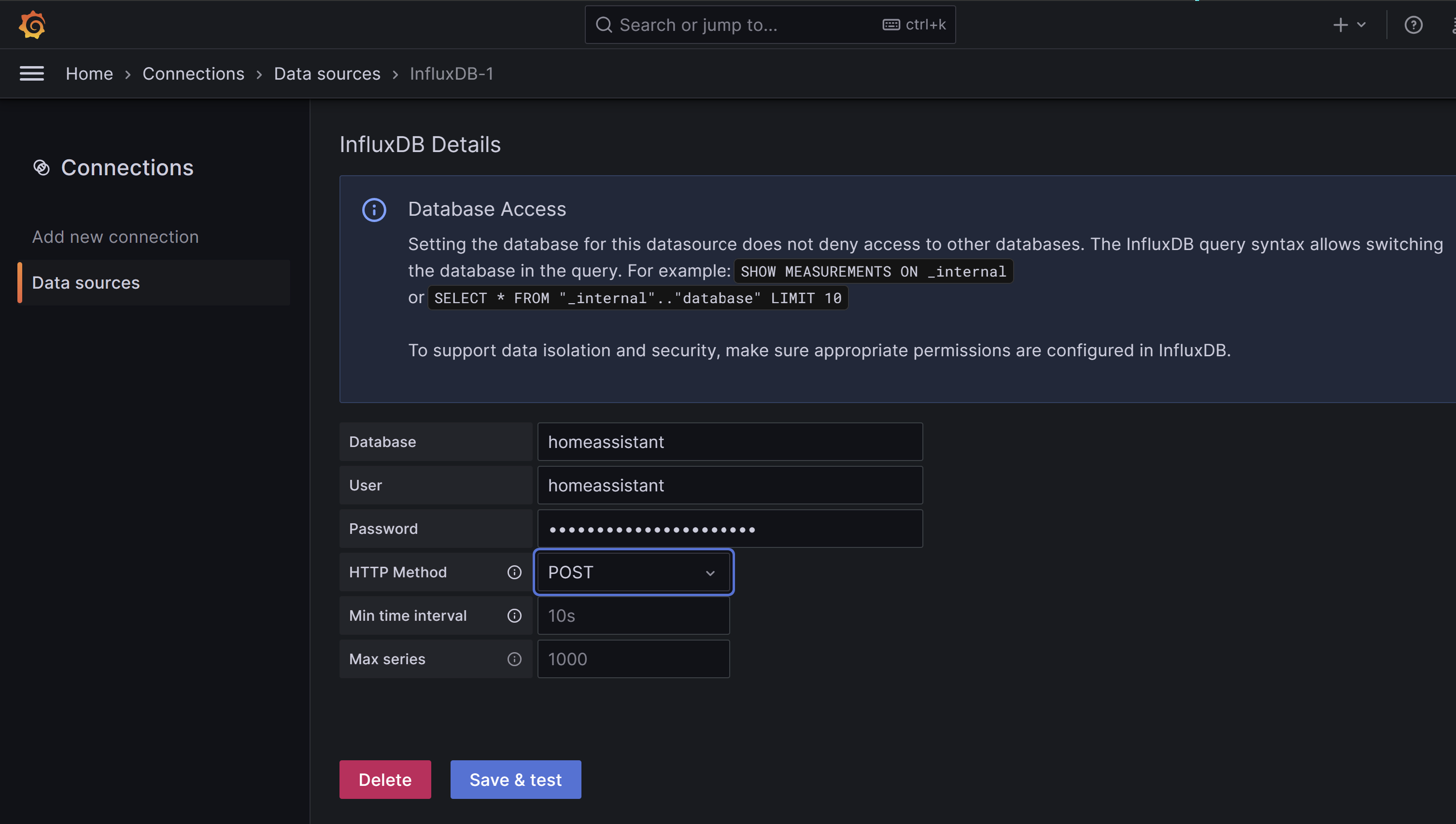
- Set the database to
homeassistant. - Set the user to
homeassistant(or optionally create a new InfluxDB user that only has readonly access on the homeassistant database). - Choose
POSTbecause it supports larger queries. - Save and test the connection.
You should now have a working environment where data from sensors is saved in InfluxDB and Grafana can read it from there.
Create the dashboard
With the yak shaving out of the way we can finally start building the dashboard. From the data sources overview we can directly create a new dashboard using the Build a dashboard button, clicking on Add Visualisation and selecting InfluxDB as datasource.
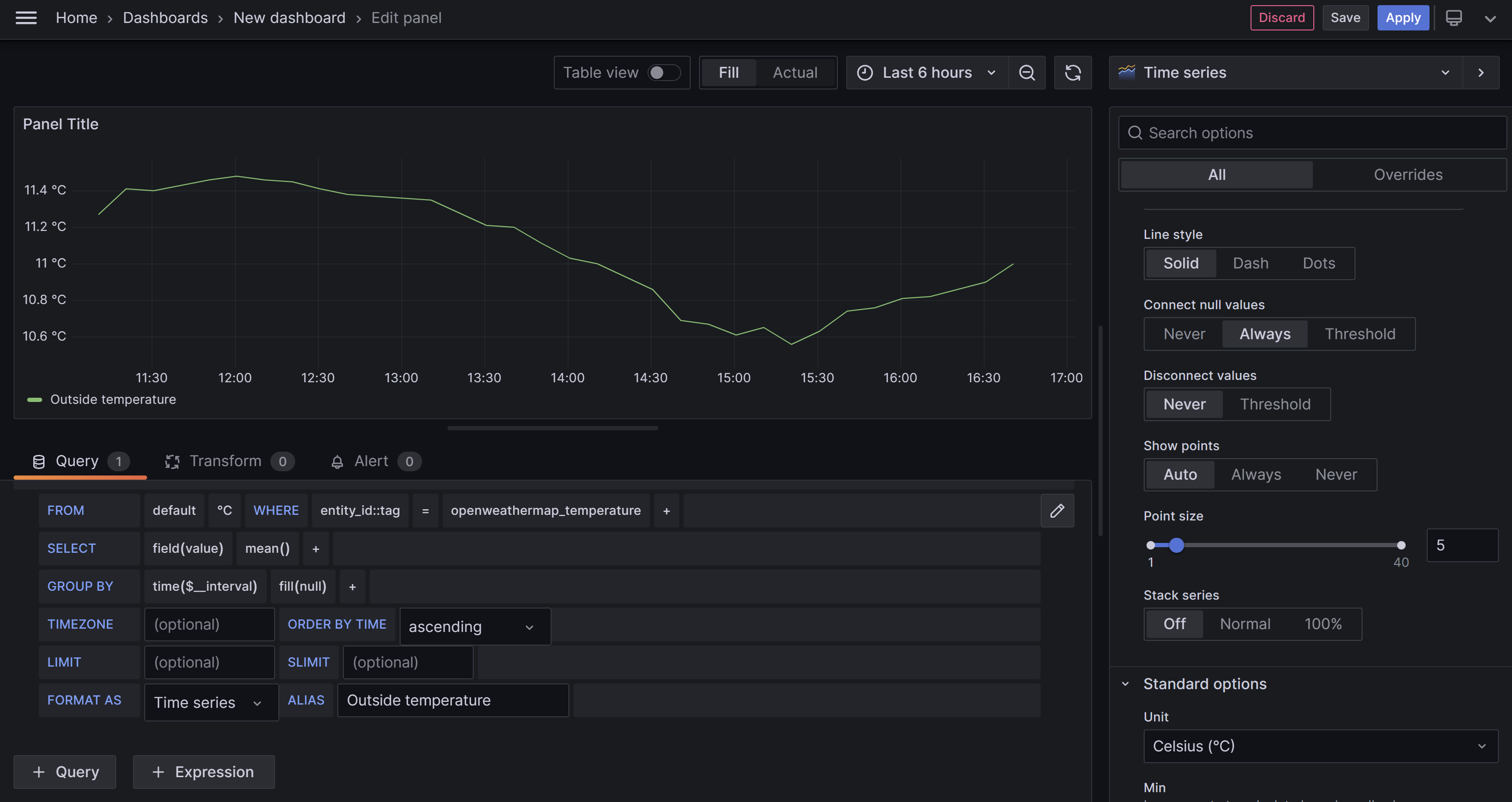
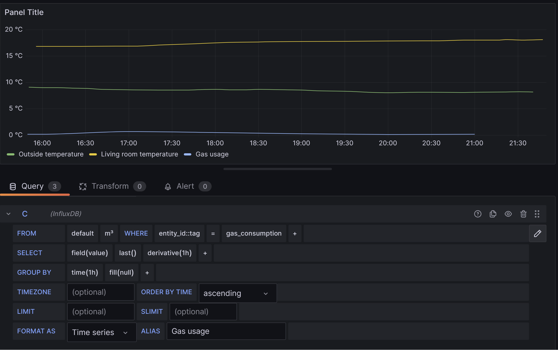
We start with a simple line chart for the outside temperature. If you’re not familiar with InfluxQL then the visual query editor is the easiest way to setup the query. Search for the entity_id tag of the sensor that measures the outside temperature, in my case openweathermap_temperature.
To connect the individual points we need to set the Connect null values option to Always in the options panel. Also set the Unit to Temperature / Celcius under Standard Options.
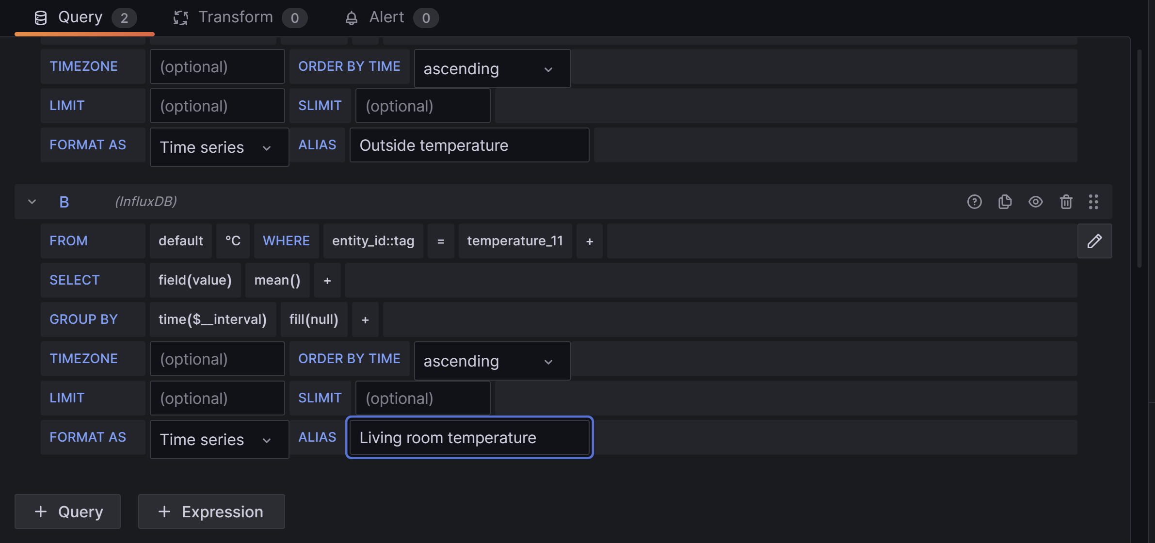
Adding the room temperature is identical to adding the outdoor temperature. In the same screen, add a new query by pressing + Query, adding a similar query as before and finding the correct sensor name.
The final query is for the gas usage. This is a bit more complicated because the gas (and electricity) sensors always measure the total amount of energy consumed. In my case the sensor measures the totals every 5 minutes. In order to turn this absolute value into something useful we’ll need to calculate the delta between 2 points in time. For this we’ll use the derivative function.
We’ll recreate the original energy dashboards which groups the gas usage by hour in the day view.
In our query we’ll also group the data by hour and set the derivative time duration to 1 hour. For this to work properly we should not take the mean of the group, but the last value in the group so the derivative uses the highest value each hour. The query will look like this:
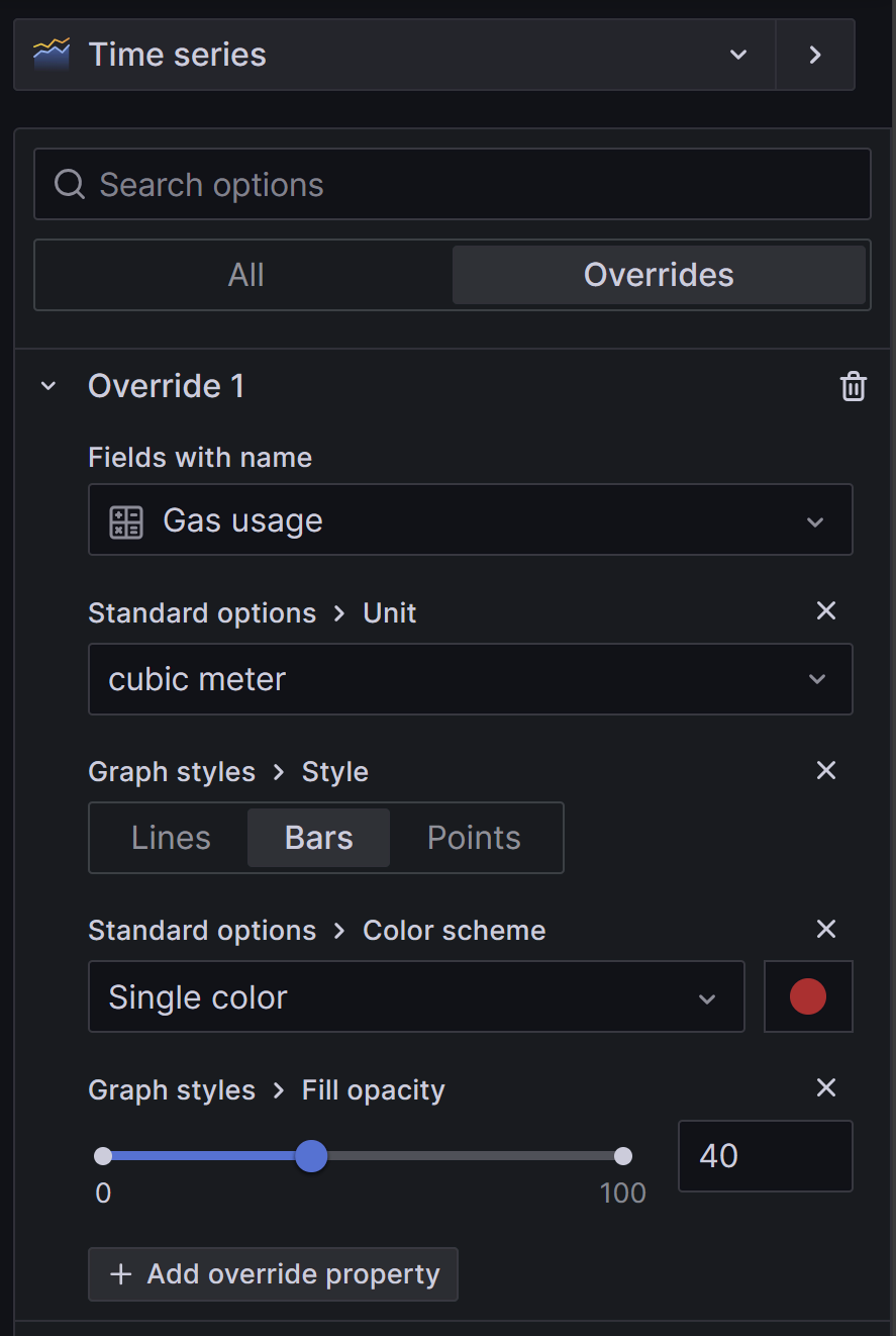
The gas graph is not very usable yet, since it’s displayed on the same scale as the temperature. We’ll need to override the unit of the query in the options pane. And while we’re at it we change the style to a bar chart.
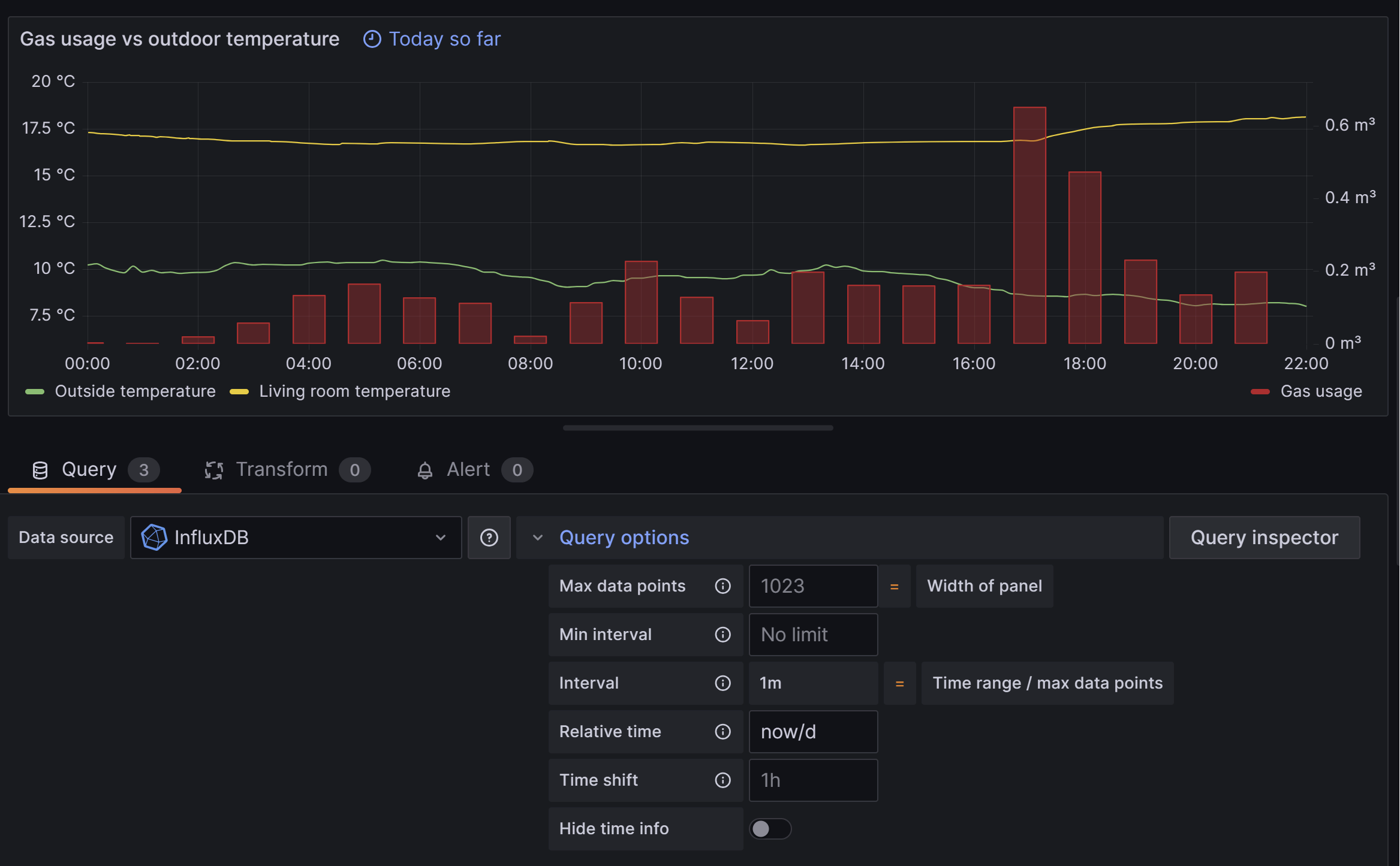
This should look much better. The final thing left for our daily gas usage panel is to set the time range. We do this by opening the query options and setting the relative time to now/d. This will set the time range from the start of the day at 00:00 until the current time.
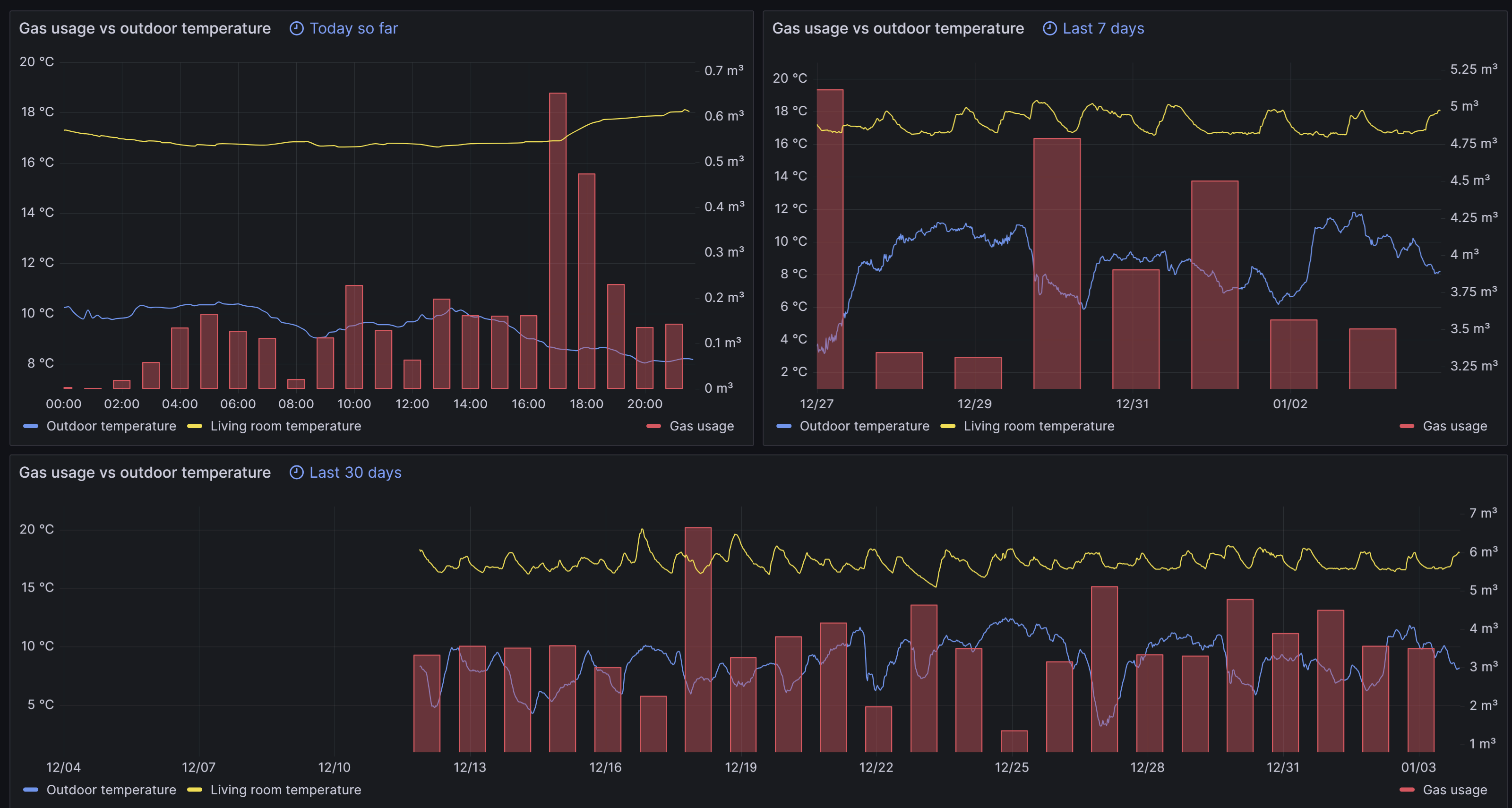
To create panels for different time ranges in the same dashboard simply duplicate the daily panel and change the query options. For a weekly view similar to the Home Assistant energy card set the relative time to now-7d/d, group the gas by 1d and set the derivative also to 1d. You can do the same for a panel that displays the last 30 days.
The final result looks something like this:
Final notes
We now have a decent dashboard that provides insights in gas usage over time, which can assist in reducing energy consumption.
There’s some technical debt I will need to address at a later stage: the InfluxDB data retention. If we take no action the database will grow and become quite big. This can be solved by downsampling the data after a certain period of time using retention policies and continuous queries. More on that here.